

Abstract
Many articles about HubSpot landing page examples suffer from the same problem: they are not actually about HubSpot landing pages. Some are template marketplaces that promote their own products, while others feature pages using HubSpot forms while the underlying experience occurs on Webflow, or a custom stack. Some use HubSpot’s marketing pages as examples, but fail to acknowledge that they operate on infrastructure that the majority of HubSpot CMS users can’t replicate.
None of that helps a marketing leader trying to improve demo conversion rates, increase webinar registrations, or launch new campaigns inside HubSpot next quarter.
This guide takes a different approach, with each example reviewed through a HubSpot CMS lens and flagged for verification through BuiltWith to confirm whether HubSpot hosts the pages itself. We organize examples by campaign goal, because this is the core benchmark for how teams measure their work.
More importantly, we evaluate landing pages as nodes in a growth marketing system. Messaging, lifecycle stages, attribution, sales handoff, and nurture sequences all influence performance. Visual design is only a single part of the equation, and every example is scored against a consistent five-point framework, supported by HubSpot-specific implementation guidance.
The Five-Point Framework We Use to Evaluate Every HubSpot Landing Page
Many landing page roundups focus on visual style, copywriting, or conversion tactics in isolation. We evaluate HubSpot landing pages differently because the platform allows the page to operate as part of a broader growth system, instead of a standalone campaign asset.
HubSpot Landing Pages are Their Own Category
Not all landing pages are created equal. Pages built on HubSpot CMS can take advantage of platform-native capabilities that fundamentally change how it functions inside a marketing system.
Features like HubDB, Smart Content, progressive profiling, workflow automation, lifecycle-stage management, and attribution tracking allow HubSpot landing pages to do more than just capture form submissions. These influence how visitors are routed, how lead data is enriched over time, and how marketing teams measure performance.
Many articles combine pages built on entirely different platforms. A Webflow or WordPress page that embeds a HubSpot form isn’t the same thing as a landing page that exists natively inside HubSpot CMS with workflows and lifecycle automation from the start.
The best HubSpot landing pages use the platform’s native capabilities and connect directly to the systems responsible for driving revenue.
Why We Organize Landing Pages by Campaign Goal
Many landing page roundups are organized by industry or design style. That makes browsing simple, but it’s rarely how marketing teams approach this implementation.
Marketing leaders typically begin with a specific objective, which could be launching a demo request page, increasing webinar registrations, or improving price comparison experiences. Each goal changes the structure of the page, the proof needed, and the HubSpot configuration that occurs behind the scenes.
A demo request page requires routing logic and qualification workflows. Webinar registration pages need reminder sequences and event automation. Pricing comparison pages require different trust signals than what a resource download page would need.
This is why we organize this guide around campaign goals, not aesthetics. This reflects how modern growth marketing services teams evaluate performance and how effective HubSpot implementations and website strategy and design connect campaign assets to broader business outcomes.

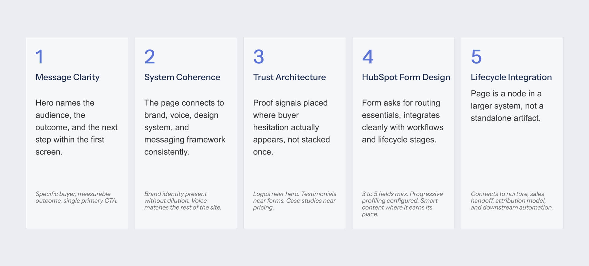
The Five-Point Framework: Message Clarity, System Coherence, Trust Architecture, HubSpot Form Design, Lifecycle integration
We developed this framework after reviewing dozens of HubSpot CMS implementations and recurring patterns across landing page audits. Every example in this guide is scored against five dimensions that determine whether a landing page works as both a conversion asset and a system asset.
Message Clarity: evaluates whether the hero section identifies the audience, communicates the outcome, and makes the next step obvious within the first screen.
System Coherence: examines how well the page aligns with broader **brand and messaging frameworks** (NO LINK AVAILABLE). Strong pages reinforce the same positioning, voice, and design logic found across the wider website. They’re part of a system rather than a campaign that’s built in isolation.
Trust Architecture: evaluates whether proof appears where buyer hesitation occurs, not simply collected in a footer.
HubSpot Form Design: focuses on conversion efficiency. Strong forms collect routing essentials, use progressive profiling intelligently, and avoid creating friction through unnecessary fields.
Lifecycle Integration: evaluates what happens after conversion. The best pages are able to connect into nurture programs, sales handoff processes, attribution systems, and broader **content strategy and growth systems** (NO LINK AVAILABLE).
Together, these five different dimensions provide a useful framework that moves beyond simply considering whether a page looks modern or converts well.
Running this framework across HubSpot CMS builds is part of how we approach growth marketing. See the wider system.
Demo Request and Lead Gen Landing Pages Worth Modeling
Demo request pages are typically the most important pages in B2B marketing programs. They remain at a point where interest becomes pipeline, which makes them one of the few assets responsible for creating sales conversions.
The best HubSpot examples combine conversion strategy with operational discipline. They are worth studying because they connect conversion, qualification, routing, and sales handoff inside the same system, while also maintaining the **visual identity and design systems** (NO LINK AVAILABLE) that makes the experience credible. You can see how we apply this across client engagements.
What a Strong Demo Request Page Has to Do
Many B2B teams treat demo request pages like product pages. The page is attempting to secure the conversation that will help move the deal forward.
Demo request pages serve a different purpose to awareness-stage campaigns. Buyers want to understand what they will see, who they’ll speak with, and whether the conversation is relevant to their scenario. Strong pages reduce uncertainty around the meeting instead of trying to explain every product feature.
On HubSpot CMS, the page is also performing operational work behind the scenes. Form submissions are able to trigger routing logic, lifecycle-stage updates, lead qualification workflows, attribution tracking, and sales handoff processes through the platform’s native capabilities.
We see the same failure modes repeatedly: generic headlines paired with heavy forms, demos offered without explaining what will be covered, meetings positioned as sales pitches instead of valuable working sessions, and lead routing processes that break as volume increases.
Recommended: HubSpot Marketing Hub Demo Page - Persona Routing as the Pattern
HubSpot’s own Marketing Hub demo page functions as more than a conversion asset. It acts as a teaching tool for the platform itself. Throughout the experience, visitors are shown how segmentation, personalization, and lifecycle thinking improves conversion while reducing friction.
The most interesting pattern is persona routing. Instead of treating every visitor the same way, the page creates pathways based on business context, lifecycle stage, and likely use case. Combined with Smart Content capabilities, the experience adapts to factors including industry and company size, making the page more relevant without the need for multiple versions.
Customer logos are prominent, trust signals are visible throughout, and visitors get a clear preview of what’s included in demo conversations. This reduces uncertainty, and positions the meeting as a valuable working session.
Framework Score:
- Message Clarity: 5/5
- System Coherence: 5/5
- Trust Architecture: 5/5
- HubSpot Form Design: 5/5
- Lifecycle Integration: 5/5
What to Copy
The persona-routing pattern is arguably the strongest Smart Content use case in this category. Very few organizations implement this as cleanly as possible, but HubSpot showcasing its own platform means it’s difficult to match this level of polish. Teams with smaller budgets can replicate the approach if they commit to segmentation and Smart Content discipline.
Recommended: Avidly Agency - Modular Service Blocks for Lead Generation
Avidly provides useful examples of how HubSpot agencies can build their own lead generation experiences. As one of the largest HubSpot agencies in the world, Avidly uses its own website to illustrate how HubSpot CMS supports scalable content operations instead of simply attractive page design.
Using modular service blocks that can be updated independently is one of the most notable patterns. When paired together with HubDB, this creates a flexible system that helps marketing teams manage content without a reliance on developers for every update.
Lead-generation CTAs are distributed naturally across the experience, enabling visitors to move between educational content and conversion points, without a need for encountering dead ends.
Framework Score:
- Message Clarity: 4/5
- System Coherence: 5/5
- Trust Architecture: 4/5
- HubSpot Form Design: 5/5
- Lifecycle Integration: 5/5
What to Copy
The HubDB-driven modular content pattern is an effective and practical solution, because it scales easily, supports content governance, and lets marketing teams update content without reliance on developers.
Recommended: Vidyard - Product as the Lead Magnet
Vidyard’s approach varies compared with many B2B lead-gen pages because it treats the product as the lead magnet. Instead of detailed qualification forms, Vidyard utilizes free video recording functionality as a point of entry, and allows onboarding behavior to function as qualification signals.
This reduces friction as the page allows prospects to experience the product immediately, as opposed to having to justify their interest in advance.
Framework Score:
- Message Clarity: 5/5
- System Coherence: 4/5
- Trust Architecture: 4/5
- HubSpot Form Design: 5/5
- Lifecycle Integration: 4/5
What to Copy
When a product has a credible free tier, the product takes care of the qualification. Vidyard shows that reducing form friction can result in better qualification data because engagement is more valuable than self-reported information.
Webinar and Event Registration Pages Worth Modeling
Webinar and event registration pages perform a different job and function from demo request pages. Rather than converting buyers, they attract prospects who look to evaluate expertise. The strongest examples here balance educational value, speaker credibility, as well as operational follow-through.
What a Strong Event Registration Page Has to Do
Most webinar registrations can be won or lost before a visitor ever reaches the form. It’s important to provide buyers with a compelling reason to spend their time, which means avoiding generic webinar topics.
Strong event pages make several things immediately clear: who’s speaking, what is covered, and what attendees will leave with. Specificity is important. Webinars that promise marketing insight are much less compelling than the ones that outline three concrete takeaways and explain exactly how the session should be structured.
On HubSpot CMS, the registration page is only a single part of the experience. The platform can manage confirmation emails, calendar invitations, reminder sequences, attendance tracking, and post-event nurture workflows. Registration pages can generate conversion, but workflows determine whether that conversion is a meaningful engagement.
Many event pages fail for the same reasons, and these include: vague topics with no clear outcome, speaker credibility that’s not established, forms that require too much information, and event workflows that stop once registration is confirmed.
Recommended: Aircall - Speaker Authority and Agenda Specificity
Aircall’s webinar registration pages demonstrate patterns that a lot of B2B marketers overlook: expertise is easier to trust when attached to a person.
Rather than leaning on the Aircall brand alone, the webinar pages highlight the speakers involved. This creates credibility and gives visitors confidence that the session provides practical value.
The second strength is agenda specificity. Instead of positioning the webinar around a broad topic, Aircall outlines what is covered, the order topics are addressed in, and concrete outcomes that attendees can expect. This reduces uncertainty, and visitors can decide quickly whether the event deserves their time.
Registration is also a low-friction experience. Short form removes unnecessary barriers, while the supporting workflow can handle confirmation emails, calendar invitations, reminder sequences, and post-event follow-up.
Framework Score:
- Message Clarity: 4/5
- System Coherence: 4/5
- Trust Architecture: 5/5
- HubSpot Form Design: 5/5
- Lifecycle Integration: 5/5
What to Copy
Specific agendas outperform vague positioning. If your visitor can’t instantly understand what they should learn, this means that registration rates will suffer. Strong webinar pages are ideal for selling outcomes.
Recommended: IMPACT Plus Webinar Registration
IMPACT Plus provides a great example of operational efficiency. The organization runs webinars constantly enough that manual page creation turns into a bottleneck.
The value of the approach is in the system as opposed to the design. Having consistent page structure allows new events to launch quickly while maintaining the same experience, messaging hierarchy, and workflow configuration. Rather than rebuilding the process, the team updates event-specific content, reusing the underlying framework.
The same principle extends to event communications, where registration confirmations, reminders, attendance follow-up, and nurture sequences are connected to reusable workflow assets.
Framework Score:
- Message Clarity: 4/5
- System Coherence: 5/5
- Trust Architecture: 4/5
- HubSpot Form Design: 5/5
- Lifecycle Integration: 5/5
What to Copy
Build the webinar registration template once and attach the workflow library to it. Future webinars become content updates rather than new builds. This results in faster execution, consistent experiences, and less operational overhead.
Pricing and Comparison Pages Worth Modeling
Pricing and comparison pages exist at the bottom of the funnel, and visitors who arrive at these pages are still trying to decide which solution to choose for their budget. The best options reduce uncertainty, build confidence, and help buyers justify their decisions.
What a Strong Pricing or Comparison Page Has to Do
Pricing and comparison pages target buyers looking to evaluate alternatives. At this point, trust is as important as product capabilities. Visitors want to understand what they’ll pay, what they’ll receive, and how this compares with other options.
Strong pricing pages are transparent about cost and provide an honest pricing range when fixed pricing isn’t practical. The most successful comparison pages acknowledge competitors in a balanced way, explaining the differences. Buyers evaluate multiple options at the same time, which means that one-sided comparisons do little to help develop credibility.
On HubSpot CMS, many pricing pages use HubDB to take charge of pricing tiers, feature modules, and supporting content with no developer involvement. Comparison pages utilize Smart Content to surface industry-specific proof, messaging, and value propositions that are more relevant to the context.
The common failures here are predictable: hidden pricing that shows a lack of confidence, comparison pages that dismiss competitors instead of evaluating them fairly, as well as messaging that doesn’t articulate why a specific option is better than another.
Recommended: 6Minded - Conversion Path Through Pricing
(Based on HubSpot Implementation LP rather than a dedicated pricing page)
6Minded showcases a vital principle that a lot of pricing pages overlook: higher-intent buyers need more information, not less. As opposed to treating pricing as a final destination, the experience creates pathways that help visitors keep evaluating the solution based on commitment levels.
The most robust pattern is the connection between pricing tiers and supporting proof. Visitors are encouraged to explore additional information that’s relevant to their situation, including implementation consideration, and examples that help validate the investment. This provides a more complete decision-making experience, reducing the need for buyers to leave the page.
From a HubSpot CMS perspective, this structure reflects the benefits of modular content management. Pricing information, supporting proof, and conversion paths can be updated independently, and this makes it simpler for marketing teams to maintain this experience.
Framework Score:
- Message Clarity: 4/5
- System Coherence: 5/5
- Trust Architecture: 5/5
- HubSpot Form Design: 4/5
- Lifecycle Integration: 4/5
What to Copy
A lot of pricing pages lose persuasion as commitment grows, but the opposite approach actually works better. Higher-intent buyers need stronger proof, clearer implementation guidance, and greater reassurance before they make a decision. Pricing pages need to reveal greater supporting evidence at each tier.
Recommended: Mention - Industry-Specific Comparison Variants
Mention provides useful examples of the way comparison content scales without creating dozens of separate experiences. The company maintains multiple comparison pages against competitors while keeping the underlying structure consistent.
The interesting thing about this approach is that it provides the ability to tailor content to different audiences. Instead of presenting generic comparisons, the framework makes it easier to tailor proof, positioning, and messaging to different audience segments. This approach mirrors how HubSpot’s personalization is designed to work.
As a result, comparison experience stays relevant to multiple audience segments while avoiding issues of operational complexity.
Framework Score:
- Message Clarity: 5/5
- System Coherence: 4/5
- Trust Architecture: 5/5
- HubSpot Form Design: 5/5
- Lifecycle Integration: 4/5
What to Copy
Industry-specific Smart Content variants can be considerably more effective than building comparison pages for each segment of your audience. Visitors receive more relevant experiences, while marketing teams benefit from simple and maintainable content structures.
Resource and Content Download Pages Worth Modeling
Resource download pages aim for a different type of visitors than demo requests or pricing pages. These prospects are typically still researching the issue or gathering information before committing to a decision. The best examples here create fair value exchange, where content is useful and form friction reflects value.
What a Strong Resource Download Page Has to Do
Resource download pages are successful when the value of the content justifies the exchange. Visitors will be more likely to provide contact information if they’re convinced a resource will save them time and solve their problems.
The quality of the preview matters as much as the content itself. Strong pages explain what’s included and what the reader gains from reading it. Generic lead magnets and promises seldom perform as well as assets with defined outcomes.
On HubSpot CMS, resource download pages utilize progressive profiling to reduce visitor friction. Contacts are able to provide new information over time, rather than competing for the same form fields. After conversion, resources typically feed into a nurture sequence aligned with the topic, and this helps marketers continue the conversation based on interest.
The most common failure modes are easy to spot: content should never have been gated, forms that ask for more information than the resource justifies, and download experiences that end without any meaningful follow-up.
Recommended: Pepperland Marketing Free Audit
(Note: Using Pepperland’s 187 Point SEO Self-Audit Checklist landing page as the closest match to the brief request)
Pepperland demonstrates one essential principle: prospects are more likely to convert when they understand what they’re receiving.
Instead of relying on generic consultation offers, the landing pages present specific deliverables. Visitors know they’ll receive a 187 Point SEO Self-Audit Checklist, alongside supporting resources that can identify technical SEO issues. The page clearly outlines what is included, and visitors know precisely what they’re getting before they reach the form.
This specificity is crucial for justifying the form. While the page collects more than just an email address, the value of this resource supports the exchange. Visitors understand what they’re receiving, as well as why the information is being requested.
The broader lesson here is that content assets convert the best when they’re positioned as practical tools. Pepperland treats this resource as something useful, and the value exchange becomes obvious.
Framework Score:
- Message Clarity: 4/5
- System Coherence: 4/5
- Trust Architecture: 4/5
- HubSpot Form Design: 4/5
- Lifecycle Integration: 5/5
What to Copy
Having specific deliverables is far more useful than, and will consistently outperform, vague offers. Visitors need to understand what they’ll receive, what problems it helps solve, and why this is worth exchanging their contact information.
Recommended: HubSpot Report Download Pages
HubSpot’s report download pages represent one of the best examples of content-driven lead generation. Rather than asking visitors to convert on broad promises, the pages provide enough information for prospects to evaluate the value of the report before completing the form.
The most effective pattern here is the report preview. Visitors are shown what the report covers, who contributed to the research, and the specific insights they can learn. This reduces uncertainty and provides a much lower-risk option.
These pages also function as a broader content marketing system. Progressive profiling reduces friction for known contacts, but post-download workflows align follow-up communication with the topic of the report. The conversation here should be treated as the start of a new working relationship.
Framework Score:
- Message Clarity: 5/5
- System Coherence: 5/5
- Trust Architecture: 5/5
- HubSpot Form Design: 5/5
- Lifecycle Integration: 5/5
What to Copy
Show the resource before asking for the conversion. Preview pages, highlight contributors, and make a list of specific takeaways. The more clearly visitors understand how they’ll benefit, the easier it becomes to justify the exchange.
HubSpot-Specific Implementation Patterns, Anti-Patterns to Avoid, and Where to Start
The examples throughout this guide highlight the different campaign goals. However, each of them shares a common characteristic: they all operate as part of a larger system. The leading HubSpot landing pages connect automation, conversion, attribution, and lifecycle management into one single streamlined experience.
The 10 Elements Every HubSpot Landing Page Should Have
The visible elements of a landing page typically get the greatest attention because they’re easy to review, simple to critique, and straightforward to redesign. The invisible components often have a greater impact on performance because they determine how the page integrates with the wider marketing system.
Five visible elements need to appear on almost every HubSpot landing page:
- Persona-routed hero using Smart Content where appropriate
- Single dominant CTA aligned to a single campaign goal
- Customer logo grid managed through HubDB
- Proof positioned near decision moments
- Form containing routing essentials only, supported by progressive profiling
Five invisible elements should sit behind the experience, and they are:
- Workflow trigger activated by form submission
- Branching workflow logic based on conversion type
- Lifecycle stage update on conversion
- UTM capture for attribution reporting
- A/B testing and mobile-centric QA pre-launch
A lot of teams focus almost exclusively on visible elements, but the best HubSpot implementations treat both categories equally. Aesthetically pleasing pages that lack attribution, lifecycle updates, or workflow automation may struggle to contribute to the broader funnel, despite converting leads.
The visible half of a HubSpot landing page is straightforward. The invisible half is where most builds fall short. We treat both with equal discipline. Learn more about our Webflow design and development approach.
Three Anti-Patterns We See Repeatedly in HubSpot Landing Pages
The same mistakes continue to appear across HubSpot audits, no matter the company size, industry, or campaign objective.
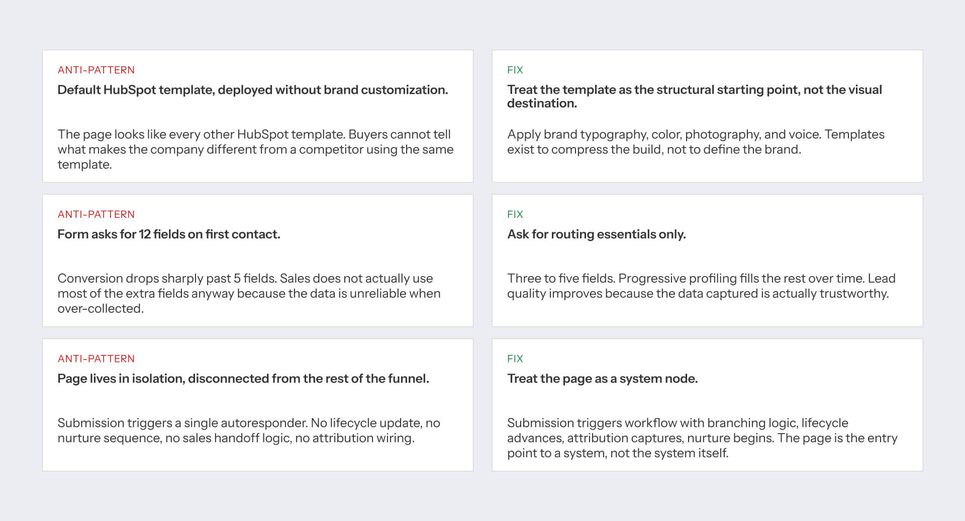
The first mistake is deploying a default HubSpot template with no meaningful customization. The template might function correctly, but it doesn’t communicate anything unique about the organization. Buyers are met with generic layouts, messaging, and design. But the fix is simple: make the template foundational, and add the company’s branding, voice, imagery, and positioning to it.
The second anti-pattern is excessive form friction. Many teams ask for ten or more fields during the initial interaction because they want more qualification data. The majority of that information is inaccurate or never used by sales teams. Collect routing essentials first, then use progressive profiling to get additional information over time.
The third anti-pattern is treating the page as an isolated asset. A submission triggers a confirmation email, but nothing else happens. There isn’t a lifecycle update, nurture sequence, attribution capture, and no sales handoff process. Landing pages technically work well, but this stays disconnected from the remainder of the customer journey. Strong HubSpot implementations treat every conversion as the beginning of a workflow rather than the end of a transaction.
A Practical Starting Plan
Many landing pages start in the wrong place. Teams focus on layout, imagery, and design before choosing how the page should operate within the broader funnel.
Choosing a more effective sequence is:
- Define a single campaign goal. Don’t combine demo requests, free trials, and content downloads on the same page.
- Score the current page against the five-point framework introduced earlier.
- Choose the most relevant example from the guide as a reference.
- Configure the invisible system elements first: workflows, lifecycle updates, attribution capture, and testing.
- Launch, measure performance, and refine based on data.
The discipline lies in the sequence. The best landing pages are rarely the result of better design alone. They perform well because the underlying system is correctly configured before visual refinements begin.
[HUBSPOT LANDING PAGE STARTING PLAN - ASSET #6]
The strongest HubSpot landing pages work like nodes in a system. Most articles teach you to build the node, not the system.
Pick a campaign goal, score your current page against the five-point framework, choose the right example to benchmark against, configure the invisible elements before fine-tuning the visible ones, then ship and measure. That is most of the work. We do this across B2B clients who treat their growth marketing as a system, not a sequence of campaigns. If that is the conversation, we should talk.
FAQs
What is a HubSpot landing page?
A HubSpot landing page is a standalone page built on HubSpot CMS for a specific campaign or conversion goal. It typically includes a form connected to HubSpot CRM, with workflows that route leads to nurture sequences and sales handoff. Importantly, many pages that use HubSpot for forms or CRM are not actually built on HubSpot CMS - they run on Webflow, WordPress, or custom infrastructure with HubSpot embeds.
How is a HubSpot landing page different from a regular B2B landing page?
The platform shapes what is possible. HubSpot CMS landing pages can use Smart Content for persona routing, HubDB for dynamic content modules, progressive profiling on forms, workflow triggers tied to lifecycle stage updates, and native attribution wiring. A landing page on Webflow or WordPress that uses HubSpot forms has none of these capabilities native to the page - the integration happens after submission.
How do I know if a landing page is actually built on HubSpot CMS?
Use BuiltWith (builtwith.com) to check the underlying CMS. Many well-known B2B brands use HubSpot for CRM, forms, and marketing automation while running the actual landing page on Webflow, WordPress, or custom infrastructure. The article you are reading verifies every example via BuiltWith and flags HubSpot CMS hosting status in the comparison table.
What conversion rate should I expect from a HubSpot landing page?
B2B SaaS landing pages typically convert 2-5% on cold traffic and 5-15% on warm or retargeted traffic, per Unbounce Conversion Benchmark Report. HubSpot CMS pages with persona routing, lifecycle integration, and progressive profiling tend to perform at the upper end of those ranges because they qualify visitors more efficiently than generic templates.
Should I organize my HubSpot landing pages by campaign goal or by industry?
By campaign goal. Most marketing teams build pages around what the page is for (demo request, webinar registration, content download, pricing comparison) rather than which industry the visitor belongs to. Industry can be a Smart Content variant inside a goal-organized page, surfaced via HubSpot's persona routing. Goal first, industry second.
How many fields should a HubSpot landing page form have?
Only the fields you need to route the lead. For most B2B demo requests, that means 3 to 5 fields: name, work email, company name, and one routing field (company size or industry). Progressive profiling fills the rest over time. Asking for 12 fields on first contact reduces conversion without improving lead quality because the over-collected data tends to be unreliable.
What HubSpot configuration should I have set up before launching a landing page?
Five invisible elements: workflow trigger from form submission with branching logic for sales-ready vs nurture-track contacts, lifecycle stage update on conversion, UTM parameter capture via hidden form fields for source attribution, A/B test variant enabled, and mobile preview validated on real devices. The visible elements (hero, form, proof) matter, but the invisible ones determine whether the page integrates with the system.
Can I use HubSpot Smart Content effectively on landing pages?
Yes. Smart Content lets you swap the hero, the proof, the form, or the CTA based on lifecycle stage, country, known list membership, or referral source. The most effective use is persona routing on the hero (visitor sees the headline and proof relevant to their persona) and industry-specific case study surfacing. The configuration overhead is real - start with one Smart Content rule per page, not five.
How long should a HubSpot landing page be?
It depends on the campaign goal. Demo request pages: 2-3 screens (hero, proof, form). Webinar registration: 1-2 screens (hero, agenda, speakers, form). Pricing comparison: 3-5 screens (positioning, tiers, comparison table, FAQ, form). Resource download: 1-2 screens (hero, content preview, form). Length should match the commitment level of the conversion action.
What is the most common mistake B2B teams make with HubSpot landing pages?
Treating the page as a standalone artifact rather than a node in the growth marketing system. Most failed HubSpot landing pages are visually fine but ship without the invisible elements (workflow, lifecycle update, attribution capture, nurture sequence). The page collects leads that then sit in HubSpot with no path forward, and marketing wonders why the campaign did not perform. The page is the front door; the system behind it determines whether anyone gets in.


